Influencers Will Use More AI There is no telling to what extent influencers will use AI in their content in the future. One thing to be sure of is that AI is a beneficial tool for various content creation tasks. Some of these tasks include creating captions, editing features, and
Why Brand Identity and Recognition are Important Your brand is what your consumers use as an identifier for your company. Many times, branding is what will set your product apart from a competitor’s. Logos, colors, and emotional connections are all elements of branding. Creating a strong brand is crucial when
Unlocking Opportunities Building your brand online is a great way to help reach a larger audience, one that is not confined to your specific location. Bringing your brand online opens up the possibility of taking your business global. This allows you to connect with partners and potential collaborators you would
Streamlining Web Management AI applications are an excellent tool for web designers and developers to use to help streamline management jobs specifically for the project they are working on. These applications allow developers the freedom to create beautiful websites that will make the user’s experience personalized and seamless. The Rise
What Makes a Strong Logo? Memorability A successful logo is instantly recognizable to a consumer and is something that they will remember once they walk away. Simplicity Overly complex logos can often be confusing and overwhelming to consumers. Consider creating a logo that communicates your brand’s message and can be
Gen Z Adaptability Gen Z is notorious for their ability to gather and share information. They also tend to be adamant about checking the facts they read online to be sure they are correct. This generation’s desire to be involved and proactive can make them feel responsible for sharing important
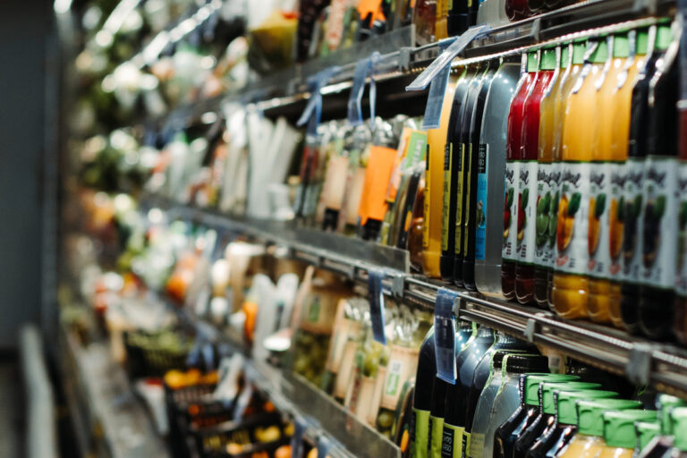
The Significance of Branded Packaging Your product’s packaging should be a part of your overall brand identity. Your packaging must reflect your brand’s colors, logo, and design elements. By including these brand elements, your product will be able to be easily recognized, which ultimately helps build brand trust and loyalty.
Sustainability Takes Precedence Consumers are more concerned with the sustainability of the products they purchase now than ever. Consumers expect businesses to be intentional about the manufacturing process, ingredients, and packaging of products. Trends show that buyers are more willing to pay a premium for products sold by brands that
Communicate Visually Visual communication is the language that speaks to Gen Z. If your audience is Gen Z, incorporating engaging visual content is the key to catching their attention. It is shown that, on average, Gen Z spends over four hours daily on a social app. Social media marketing is
The Importance of Social Media Branding Social media branding should be an extension of your business’s brand. Social media is a unique space where brands can target specific groups of people and reach a massive audience they wouldn’t have access to otherwise. Because more and more businesses establish themselves on
Start with a SWOT Analysis By beginning your branding journey with a SWOT analysis, you will better understand your strengths, weaknesses, opportunities, and threats. Analyzing these four categories will help you set your brand up for success and be prepared for anything coming your way. Define Your Target Audience and
How Will Your Project Benefit From a Rebrand? Before rebranding, it is essential to identify the purpose behind this decision before jumping in. It is important to work from a purpose when rebranding. Whether that purpose is your brand feels outdated or limited in accessibility Work With a Qualified Creative
Growing up in the San Francisco Bay Area in the 60’s, Tom developed a strong desire to create positive change for people and planet.
He went on to pursue his passion for art and design at Art Center College of Design in Pasadena, California, and worked for design firms in Southern California before moving to Boise, Idaho in the early 80’s. Foerstel Design opened its doors in 1985. Since its inception, the firm has cultivated a bold, happy, forward-looking team focussed on creating distinct and effective work on behalf of their clients.
An integral part of Tom’s philosophy is giving back to the community in which he lives — a company cornerstone that drives Foerstel’s long history of providing pro-bono services to local non-profit humanitarian and arts programs.
One of Tom’s proudest personal achievements is his ability to say Supercalifragilisticexpyalidocious backwards.