Seeing a logo that’s been in your life for years all-of-a-sudden rendered in different colors can be as jarring as a friend’s sudden dye job. They just don’t look like themselves. And if they just don’t look like themselves, how does this change the way we relate to them?
In a recent experiment, Brazilian graphic designer Paula Rupolo swapped the color schemes of competing brands’ logos, revealing much about the power of designers’ Pantone choices in determining identity. “Colors are the first thing you notice in a logo, what gets fastest to our brains,” she says. “Then you read a logo’s shape, icons, or typography.”

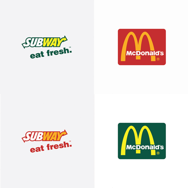
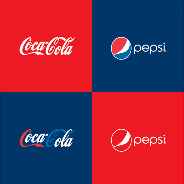
To overturn that first wave of identification, Rupolo washed the McDonald’s logo in the vegetable eco-green of Subway. Huh? Yahoo got a rainbow makeover, and Google went goth in purple and black. Coca-Cola looks uncomfortable with its new Pepsi-esque blue background, and BMW takes on Ferrari’s racy rasta-flag color scheme. Other swaps are barely noticeable: Twitter and Facebook trade their subtly different shades of blue, as do Samsung and Nokia.
“google’s colors are very iconic,
perhaps more than its typography”
“These are all big and famous brands,” Rupolo says. “They basically own the colors of their logos. When you switch to a competitor’s colors, your brain notices there’s something that doesn’t fit, that makes you go, ‘What’s going on here?’ and that’s interesting and a bit curious.”
Also interesting and a bit curious: The only instance of commenters to Rupolo’s original blog post preferring the “after” effect was when she switched Yahoo’s to Google’s color scheme, though the company’s color purple is a particularly divisive one–and it’s hard to hate on a rainbow of primary colors. “Google’s colors are very iconic, perhaps more than its typography,” says Rupolo.
The associations between colors and emotions can be both universal and highly personal. Blue, at its most basic, signifies clear-sky calm and trust; green connotes reliable, natural; and red has associations with passion, danger, and urgency, for example. But, as every design student learns, there are always exceptions. In western cultures, white means peace and honesty, whereas in eastern cultures, it’s associated with the masculine yang of yin and yang.

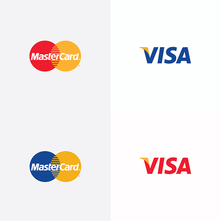
“All in all, the logos don’t look better swapped than the originals,” Rupolo says of the project’s results. “If you take the Visa x Mastercard example, you’ll notice that red doesn’t go with credit card credibility at all, but it’s acceptable when in a smaller percentage of the total color predominance.”
Different rules apply to soft drinks, however. “Of course,” Rupolo adds, “when you get to own a color as much as Coca-Cola does, you don’t need much more around it.”
“when you get to own a color as
much as coca-cola does, you don’t
need much more around it.”
She finds that when creating logos, graphic designers tend to add colors a bit too early. “You learn that shape comes first, and once you nail it, you should make color tests and explore the possible readings you get from it.” Once you attach a color to your brand book, it can be hard to make changes down the line–-like trying to change your first name in mid-life–which is why it’s not done much.
The European rebranding of McDonald’s, however, has embraced a new color scheme: green and yellow. “McDonald’s change was a successful case in my opinion, basically because they decided to get greener and healthier, and luckily, the direct complementary color of their brand was exactly what they needed.”
Rupolo has been taking reader requests for logo color swaps on her website and is expecting a second batch to come out soon. To read her original blog post on the project, click here.


[via Fast Co. | Design]

